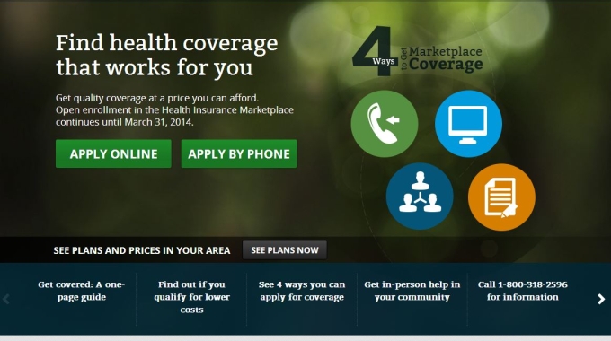
Flawed User Experience on HealthCare.gov

The new Obamacare website, HealthCare.gov, has been getting much media attention over the past few weeks due to flaws in the user experience after its launch. Heavy traffic, network problems, and design flaws have hampered users from shopping for health insurance. Many agree that the new website presents a fragmented user-experience, which was not tested properly before its launch. 

Read More

7 Ways Augmented Reality Will Improve Your Life

You might think augmented reality is the way of the future, but really, it has its roots in the 20th century. Morton Heilig, the “Father of Virtual Reality,” patented the Sensorama Stimulator, which he called an “experience theater,” on Aug. 28, 1962. Over time, the idea of using technology to create a layer over the real world has been honed and refined and put in our palms, thanks to the proliferation of smartphones.

Read More

Are Your Users S.T.U.P.I.D?

How good design can make users effective

dunce-200It is an honest question: how smart are your users? The answer may surprise you: it doesn’t matter. They can be geniuses or morons, but if you don’t engage their intelligence, you can’t depend on their brain power.

Far more important than their IQ (which is a questionable measure in any case) is their Effective Intelligence: the fraction of their intelligence they can (or are motivated to) apply to a task.

Take, for example, a good driver. They are a worse driver when texting or when drunk. (We don’t want to think about the drunk driver who is texting.) An extreme example you say? Perhaps, but only by degree. A person who wins a game of Scrabble one evening may be late for work because they forgot to set their alarm clock. How could the same person make such a dumb mistake? Call it concentration, or focus, we use more of our brain when engaged and need support when we are distracted.

Read More

Mobile UX Sharpens Usability Guidelines

Summary: Many guidelines are similar for mobile and desktop design, but their mobile interpretation is much more unforgiving.

My recent column Mobile Content: If in Doubt, Leave It Out advised site owners to eliminate secondary material when writing for mobile users. Many tweets, blog postings, and other comments on the article all expanded on this theme: Yes, do cut the fluff from mobile content, but also cut secondary content when writing for desktop websites.

In one way, I can only agree. Since 1997, conciseness has been a key guideline when writing for the web. People don’t read a lot on the web and leave in a few seconds if a site doesn’t communicate its value clearly. These findings lead to more detailed guidelines, such as emphasizing the first 2 words of nanocontent (e.g., headlines and search engine links).

So yes, cut the blah-blah from your desktop site.

Read More

Utilize Available Screen Space

Summary: Websites and mobile apps both frequently cram options into too-small parts of the screen, making items harder to understand.

A computer screen’s precious pixels are the world’s most valuable real estate. Amazon’s Add to Cart button is 160×27 pixels, or 0.003 square feet (0.0003 m2) at a typical 100 dpi monitor resolution. You could crowd almost 800,000 Buy buttons onto the floor space of the average American home, which currently sells for $160,000. Even a single Buy button will often bring in more than that — let alone the revenue from 800,000 buttons.

Normally, when something is extremely valuable, you try to conserve it. But screen space shouldn’t be hoarded, it should be spent. I see too many designs that cram highly valuable content or action items into tiny spaces while wasting vast amounts of screen space.

Read More

Why You Should Outsource Usability Testing

Small companies should consider outsourcing the facilitation of their usability testing projects. On the surface, it makes sense to have a designer/developer who has a deep understanding of the project be in charge of usability testing, but in fact this can cause serious problems.

Read More

Importance of Usability

Users should not have to think too hard when they are using your website. They should not have to refer to help screens and they shouldn’t be made to feel stupid. Simply by observing your customers you can avoid this.

Read More
Back To Top
Search